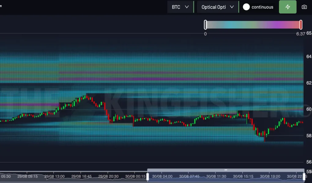
Every day, millions of traders watch charts and indicators to make sense of the crypto market. Yet one tool often delivers insights faster than any candlestick chart, the bitcoin heatmap. It’s a visual snapshot that reflects market emotion in real time, translating complex data into color-coded simplicity.
In this single glance, you can tell whether optimism or fear dominates the market. Green means growth and confidence; red means decline and uncertainty. The deeper the color, the stronger the movement. It’s not just about Bitcoin’s price, it’s about what the entire crypto market is feeling.
The Psychology of Market Colors
At its core, a heatmap mirrors collective psychology. When Bitcoin turns a strong shade of green, it’s not merely a price rise, it represents a wave of confidence flowing through investors. On the other hand, a sea of red signals anxiety, profit-taking, or macroeconomic tension.
Color, as simple as it seems, is the language of sentiment. Unlike technical indicators that lag behind price, heatmaps visualize the crowd’s reaction in real time. They tell stories: who’s leading, who’s lagging, and where capital is flowing.
A Snapshot of Market Dynamics
A bitcoin heatmap is more than a colorful dashboard, it’s a live ecosystem. Each block represents a digital asset, sized by market capitalization and shaded by its performance. Larger, brighter blocks often show where attention and liquidity are concentrated.
When Bitcoin shines green while altcoins fade red, it hints at risk aversion, traders favoring safety over speculation. But when smaller coins turn green alongside Bitcoin, it indicates broad optimism and expanding participation.
These visual cues allow traders to detect subtle shifts long before they’re evident in trend lines or reports.
Sentiment Shifts in Real Time
Markets change faster than headlines. Heatmaps provide that instant feedback loop one glance can reveal how global events ripple through crypto.
For instance, during major announcements like interest rate decisions or ETF approvals, you might see Bitcoin’s block flash green before news sites even publish an update. The market reacts instantly, and the heatmap captures that emotion live.
Watching how colors evolve throughout the day can tell you whether a move has conviction or hesitation. Quick flips between red and green often signal uncertainty, while steady shades suggest confidence.
Beyond Bitcoin: The Context It Creates
Even though the spotlight often falls on Bitcoin, the broader map surrounding it provides essential context. Seeing Ethereum, Solana, and other altcoins move in harmony or divergence helps gauge whether Bitcoin’s momentum is isolated or market-wide.
For example, a day where Bitcoin is slightly red but altcoins remain green could mean traders are rotating profits into smaller assets. Conversely, a fully red map reveals synchronized fear, a sign that the entire crypto space is under pressure.
The heatmap, in this sense, doesn’t just show price movement; it reflects the relationship between market leaders and followers.
Why Visual Tools Beat Numbers Alone
Spreadsheets, data tables, and numerical dashboards can overwhelm even experienced investors. Heatmaps condense thousands of data points into an easy visual story. The human brain processes color faster than text, which means traders can assess market health almost instantly.
It’s not about replacing analysis but enhancing it. A trader might still use technical patterns or moving averages, but combining them with a visual overview gives more context. Heatmaps transform abstract data into emotional insight and in markets driven by emotion, that’s invaluable.
Using Heatmaps Strategically
For traders and investors, interpreting the bitcoin heatmap can become part of a daily habit. Here’s how:
Morning Overview: Before diving into trades, check the map to understand the day’s tone. Are most coins green or red?
Identify Outliers: Look for coins moving against the trend. A single bright green coin in a red sea could indicate unique news or strong fundamentals.
Spot Rotations: When Bitcoin cools off but altcoins heat up, capital may be shifting to higher-risk plays, often a late-stage rally sign.
Evaluate Confidence: Sustained green across large caps often signals market-wide optimism, while mixed colors indicate indecision.
This quick analysis doesn’t require charts or deep data, just an observant eye and consistent tracking.
Storytelling Through Movement
Think of a heatmap as a living story. Each color shift is a new chapter, greed rising, fear returning, opportunity appearing. Watching it evolve through the day gives traders a sense of rhythm and flow, helping them align timing with sentiment.
For example, early morning might start with caution (faded colors), midday could see surges of green as traders react to global news, and evening might cool into neutrality. By tracking these waves, one learns to anticipate rather than react.
This storytelling aspect makes the heatmap an engaging tool not only for professionals but also for enthusiasts who want to understand the market beyond the numbers.
The Broader Lesson: Emotion Drives Markets
Behind every green or red square lies a human decision, to buy, sell, or hold. That’s why understanding sentiment is as vital as understanding price.
Heatmaps visualize these emotional tides. They reveal when optimism peaks, when fear spreads, and when stability returns. For long-term investors, they help avoid impulsive reactions; for short-term traders, they guide timing.
The deeper insight here is that markets are emotional systems wrapped in digital interfaces. Recognizing that through color gives traders a clearer, calmer perspective.
Simplifying Complexity for Everyday Users
You don’t need advanced financial skills to read a heatmap. Its design makes it accessible for beginners while remaining powerful for professionals. Whether you’re tracking trends, learning about market behavior, or just curious about how crypto moves, this tool brings clarity without jargon.
That simplicity makes it ideal for educational purposes too, it visually explains volatility, correlation, and dominance better than static charts ever could.
Conclusion
The next time you open a bitcoin heatmap, remember, it’s more than just colors. It’s a window into the collective emotions driving every trade, every rally, and every sell-off. With practice, you’ll begin to read these patterns intuitively, spotting confidence or fear before most people do.


